Buck Wild Snacks
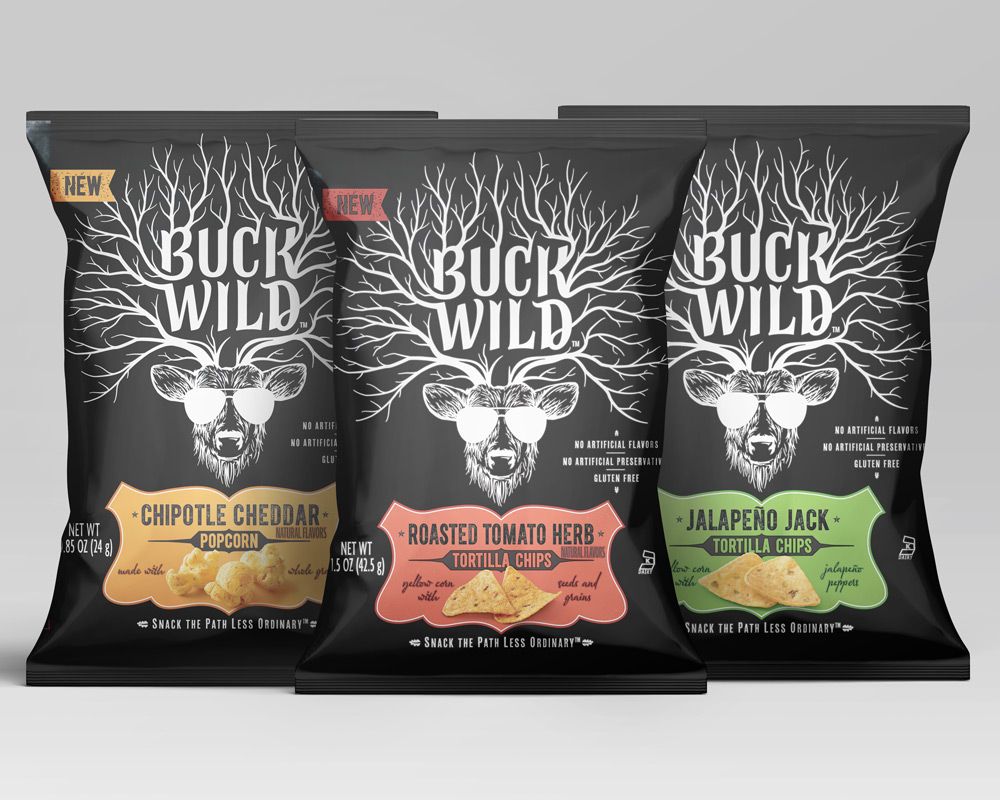
The Buck Wild line of snacks was initially tricky to produce due to the design intent versus print capabilities of flexography.
Of special note are the flavor cartouches and the yelling person on the back panel. Each flavor cartouche is built out of two spot colors to convey a “worn” look. To get around the traps required in flexography, I overprinted the darker color over the lighter color and had the darker color specially made to match its PMS color.

For the yelling person, I used two blacks to throughout the entire package and pulled back the second black from around the yelling person. This allowed for a rich black look without the compromise the process work would have caused if I only used one black.

Knorr One-Skillet Meals
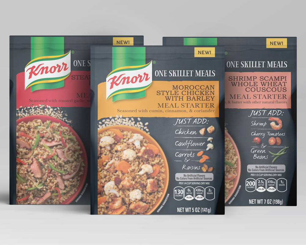
This award-winning family of items was an interesting project because of the very focused design intent of the customer. Printing with a matte lacquer so only the product shots are glossy, the customer wanted the matte areas to look like a chalkboard.
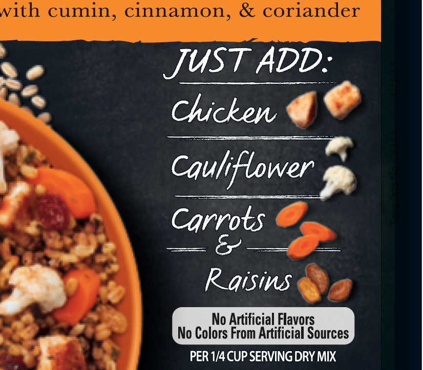
This was tricky as there is quite a bit of what’s called “dot gain” or ink filling in between the tiny heads on the printing plate. Since the chalkboard effect had a lot of fine details, the chalkboard background had to be modified significantly so the ink would not fill in the tiny areas on press.
In the end the customer was very happy with the print and this family of items went on to win the 2018 FPA Gold Award for printing and shelf impact.