Serene Stargazer Massage

For this project, the client knew they wanted an image of hands holding a stargazer lily, so I had a starting point. Being a logo I wanted to keep things fairly simple so it would look good at a variety of sizes and in a variety of applications. I kept the hands realistic, but distilled the lily down to a few key elements to enforce the idea of it being a certain type of lily as well as making it visually distinct and interesting. For the brand colors I used a select palette taken from an actual image of a stargazer lily. Finally, for the name of the business I selected fonts that worked well for a massage business, which should invoke a sense of relaxation. To add a bit of visual intrigue, I looped the “M” and “g” in “massage” around the “S” and “g” in “Stargazer.”
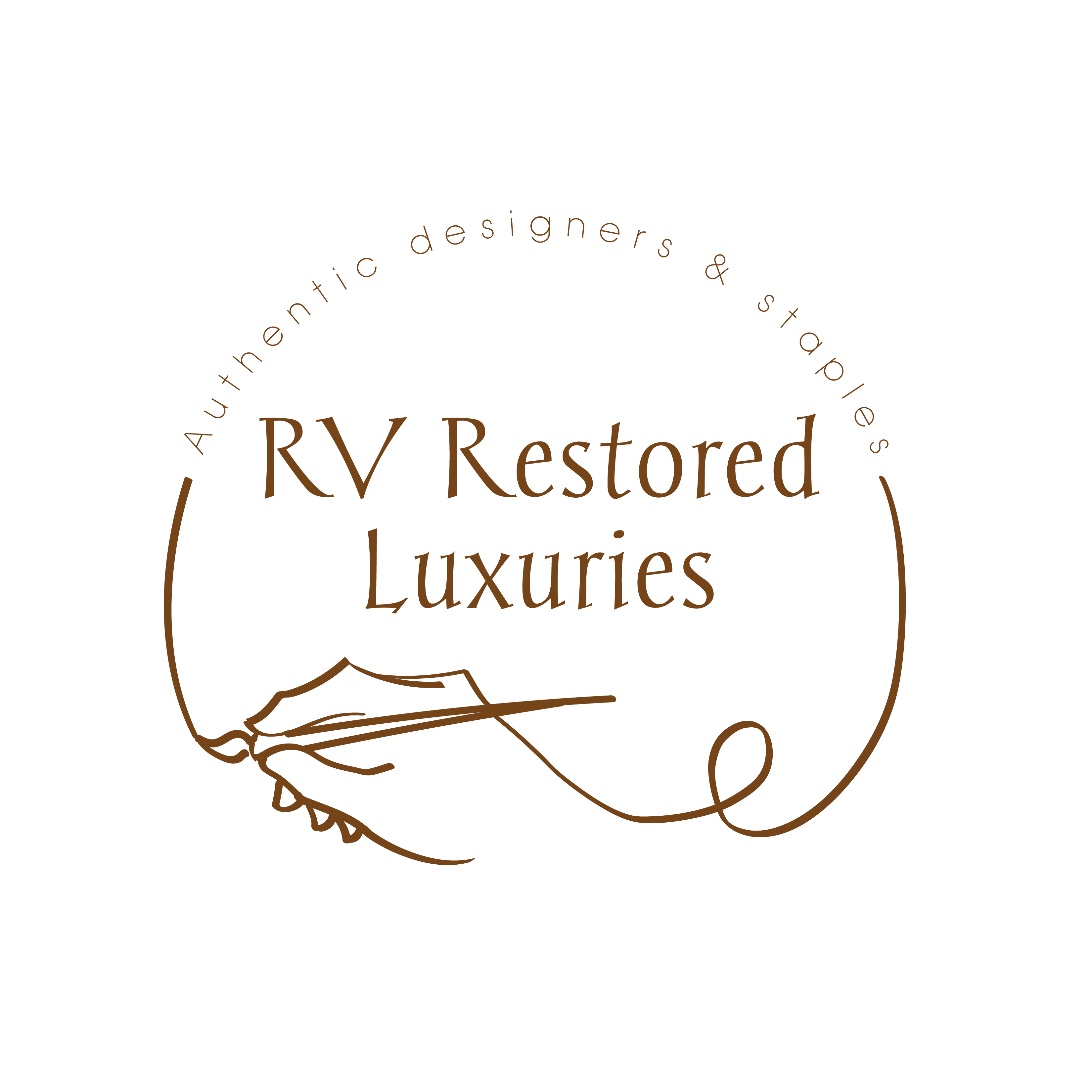
RV Restored Luxuries

For this logo the client needed something that relayed the upscale nature of her business as well as the artistic side. She knew she wanted a hand and a brush included to relay this part of her business. Knowing this, I opted for a light flourish feel to the illustration of the hand and brush. I positioned the hand to make it look like it was drawing the logo, which reiterates the hands-on care the owner puts into her work.
Cinefoundry

A logo designed for a now-defunct movie production company. The idea behind the logo was to capture the glitz of old-timey Hollywood while also referencing on the hard-working aspect of a foundry. I try not to think about how heavy that film reel would be in real life…


